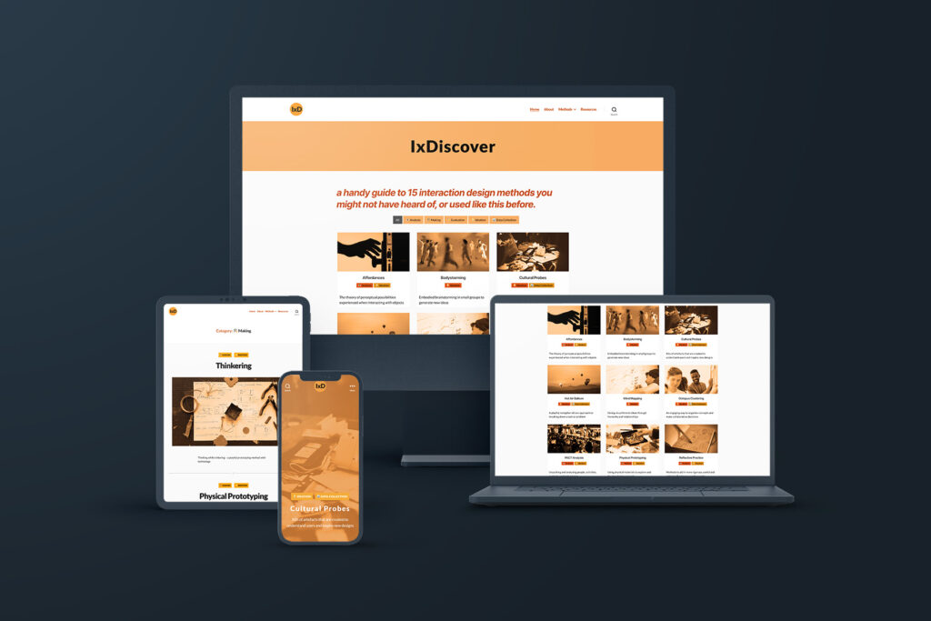
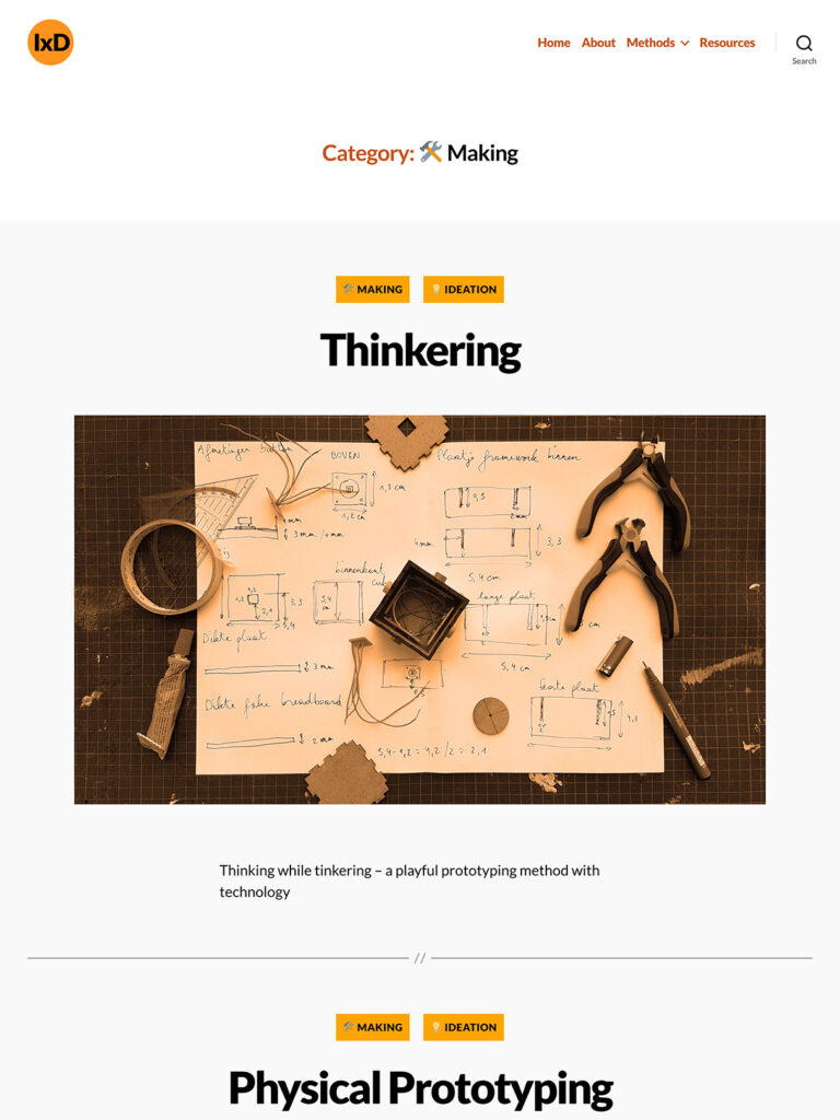
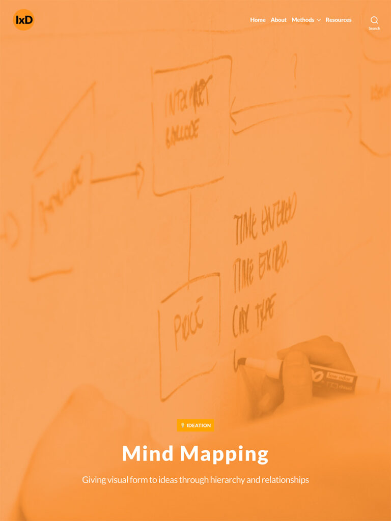
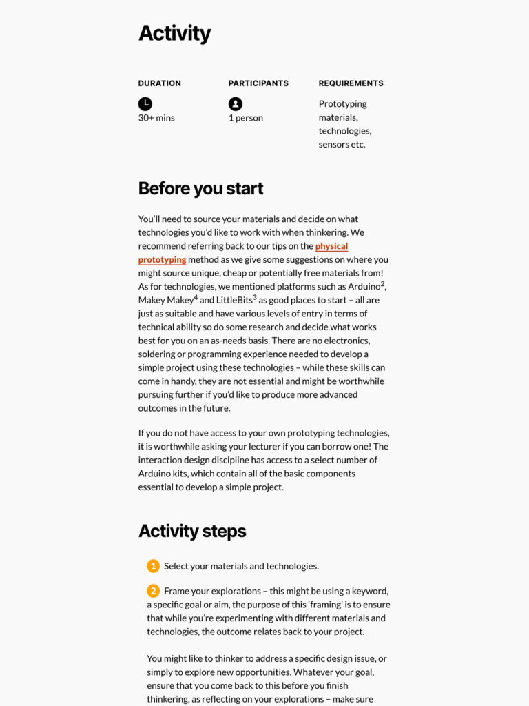
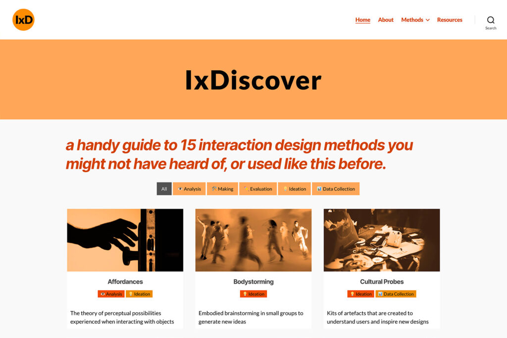
IxDiscover is a library of design and research methods, created to act as both a handy reference and support tool for interaction design students, as well as a resource for teaching staff.
My role in this project was a hybrid of researcher and designer, which lead me to write over 10,000 words of content across the series of methods and organise this within a WordPress-based website. My knowledge of HTML and CSS allowed me to customise a simple WordPress theme, resulting in a minimal, clear and impactful interface and experience for users.
What I’m most proud of in the IxDiscover project is the site’s ease of use and value it’s added to the interaction design student experience, which was feedback I’ve received from teaching staff and students quite a few times.
Asbestos, Absent is a series of infographics that tell a story about how mesothelioma, a cancer commonly associated with asbestos exposure, has impacted the lives of Australians. The series was presented digitally on The Cube, designed specifically to resonate with the target demographic, which predominantly comprised of QUT staff and students.
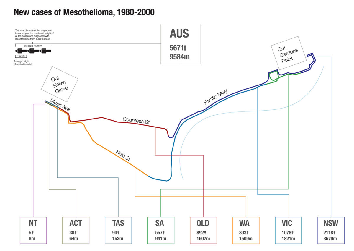
The project was designed to be read sequentially, with the first design encompassing a map-style infographic. This map details the total number of recorded mesothelioma diagnoses in the two decades from 1980-2000, and translates this figure using an average adult height. When layed across a map, the total distance of these human bodies stretched the distance from the QUT Kelvin Grove campus to Gardens Point campus, and back. A bleak image to picture, but an important message that hopes to raise further awareness of this horrible disease.
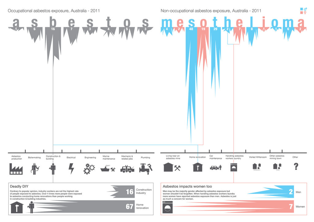
The second infographic employs a unique twist on the traditional bar graph and contrasts the 2011 figures of those who were exposed to asbestos in both workplace and non-workplace settings. The main message of this design draws attention to ongoing exposure risks faced in the construction industry as well as highlighting a little-known fact – that spouses of workers were exposed to asbestos simply because they washed their clothing in the same machine.
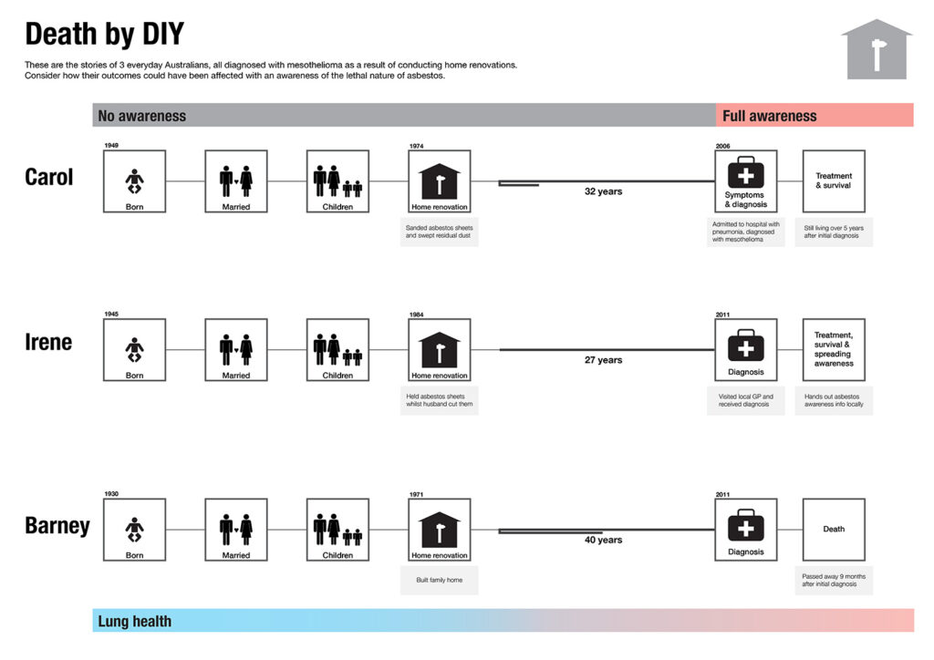
The final infographic in this series is a set of timelines, contrasting three individuals who were diagnosed with mesothelioma. These timelines were developed from qualitative data, such as news articles and interviews. These reports were examined, where I sought out patterns and commonalities in their stories. The resulting design gives a glimpse into the lives of these three individuals, emphasising the extreme variety in latency between exposure to asbestos fibres and eventually experiencing symptoms of mesothelioma. My hope with this design was to emphasise how important awareness is of the danger asbestos poses.
This project was developed through a combination of data processing in Microsoft Excel, while design was completed in Adobe Illustrator. I hope the outcomes resonate with you and that you find the story told through the work to be both informative and meaningful.
Project Details
Name: Asbestos, Absent
Year: 2013
Software: Adobe Illustrator, Microsoft Excel, Tableau
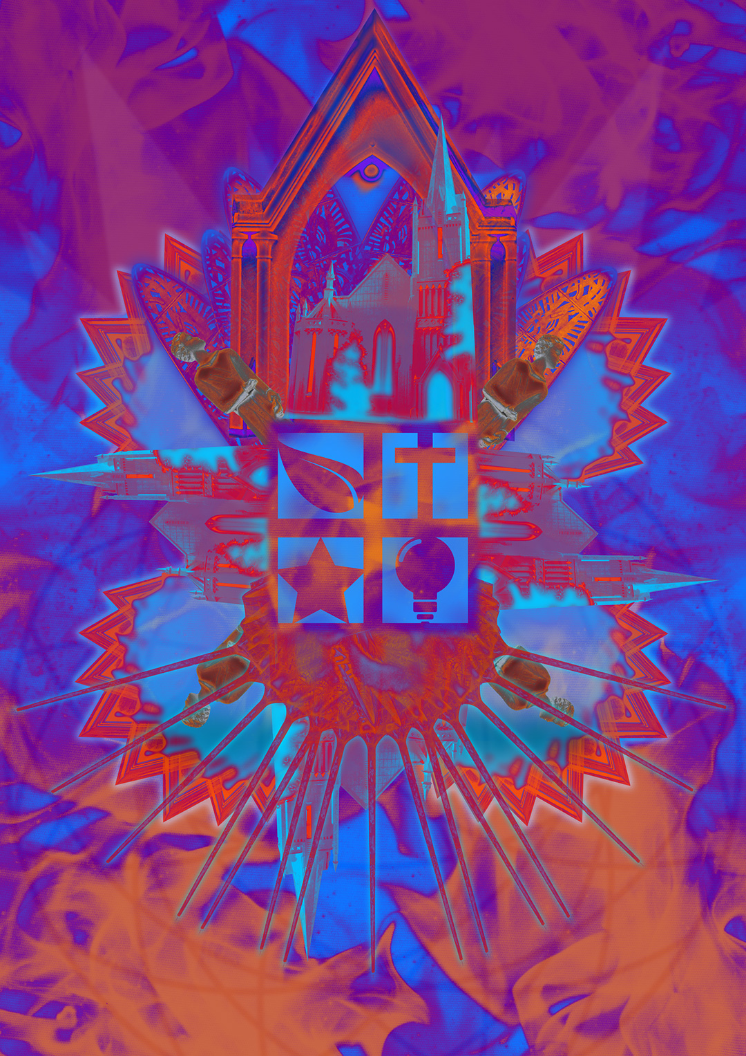
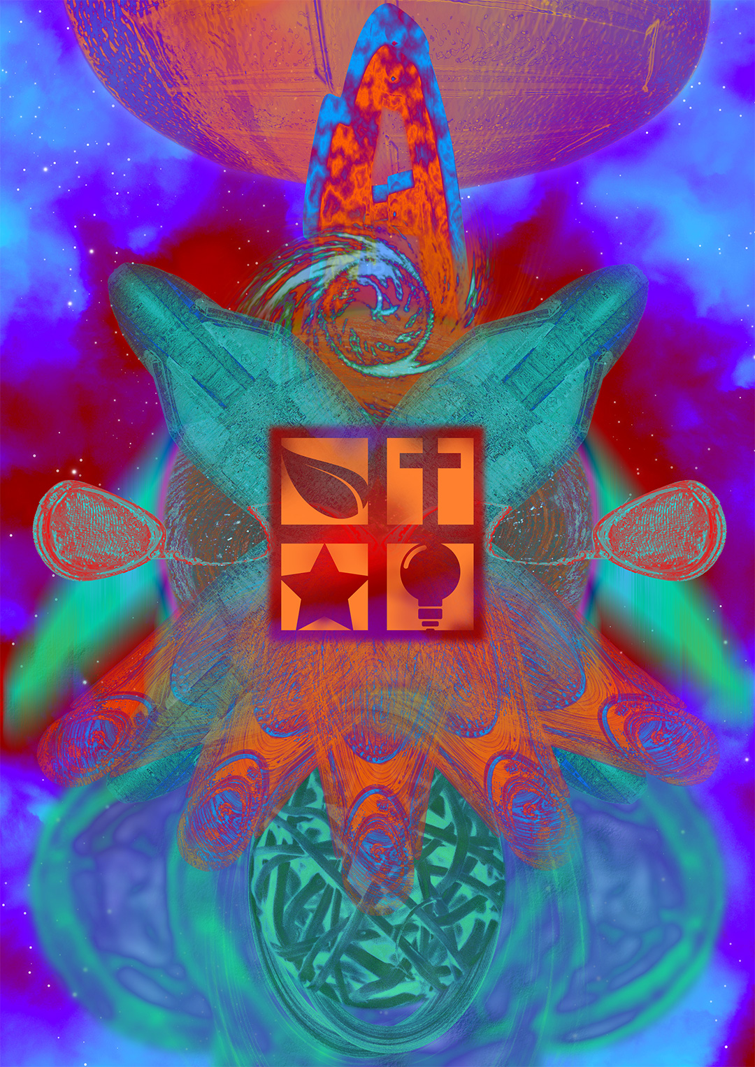
This project responded to a brief for the now defunct INVENTory space, within the QLD Museum, which called for a rebrand to engage new audiences with all that the space had to offer. The INVENTory was a versatile, collaborative space that included a rotating program of interactive, family-friendly activities that were themed around current exhibitions from within the QLD Museum. The project called for a strong, versatile brand identity, which was to be applied to three posters.
My approach to this project was highly experimental, as I sought to convey an aesthetic that captured the audience’s imagination, while encouraging creative expression. The series of posters is comprised of collaged, treated images and evokes a hypercolour, psychedelic sense of style.
The icons at the centre of each image are designed to change, depending on the current program of events taking place within the INVENTory space, which reflects the need for versatility in the design outcomes.