Categories
Blog

An Update

Sample text here

Categories
Branding Visual Communication

Tan Chiropractic

Brand Identity

Logo design, signage & business cards

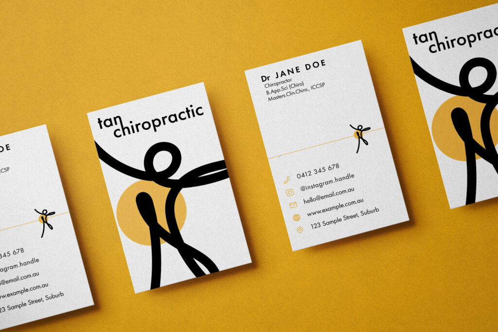
Tan Chiropractic is a Brisbane-based business that sought a brand identity to help establish a market presence while emphasising their focus on holistic approaches to chiropractic treatment and patient care.

The logo design, which formed the foundation of the identity, aimed to capture a contemporary aesthetic in form, while remaining distinctive, simple and elegant. The client was very satisfied with the logomark in particular as it effectively conveyed the business’ context (musculoskeletal-focussed healthcare) while also evoking a sense of dynamism and energy.

Supporting applications/implementations of the identity encompassed signage, business cards, social media collateral and digital outputs, which confirmed the versatility and strength of the designs.

The images below are a sample of pre-production renders.

Project Details

Name: Tan Chiropractic (Brand Identity)

Year: 2020

Software: Adobe Illustrator & Adobe Stock (for mockups/renders)

Categories
Physical Research Tangible Media User Experience Visual Communication

Recipes for Reflection

Winner

OzCHI 24hr Design Challenge

Recipes for Reflection is a collaborative project, developed with peers from design and psychology backgrounds in response to the 2016 OzCHI 24 hour design challenge.

This work responded to the challenge of fostering meaningful social innovation for an ageing population, which was an exciting and unfamiliar topic for the team to explore. Deliverables for the challenge response include a short video (design concept & prototype), design document in extended abstract format (6 page limit) and a blog for process documentation.

The project video submission, which details the project, design process and demonstrates a use-case scenario with a lo-fi prototype of the interactive recipe book.

The project team employed various methods including literature review, affinity diagramming, demographic studies, surveys and iterative prototyping, which allowed us to rapidly collate, synthesise and develop the concept into a rich, meaningful outcome. We were selected as finalists from 66 submissions and invited to present the concept to a panel and audience during the 2016 OzCHI conference, where the project was awarded as the winner; an achievement I am quite proud of.

Collaboration with Alice Brown, Claire Villalba & John Van Beusekom

Project Details

Name: Recipes for Reflection

Year: 2016

Methods: lo-fi prototyping, affinity diagramming, literature review, user surveys (data collection), thematic analysis

Software: Adobe Illustrator, Photoshop & Premiere Pro

Awards/accolades

Winner of the 2016 OzCHI Student Design Challenge

Categories
Digital Research User Experience Visual Communication

IxDiscover

IxDiscover is a library of design and research methods, created to act as both a handy reference and support tool for interaction design students, as well as a resource for teaching staff.

My role in this project was a hybrid of researcher and designer, which lead me to write over 10,000 words of content across the series of methods and organise this within a WordPress-based website. My knowledge of HTML and CSS allowed me to customise a simple WordPress theme, resulting in a minimal, clear and impactful interface and experience for users.

What I’m most proud of in the IxDiscover project is the site’s ease of use and value it’s added to the interaction design student experience, which was feedback I’ve received from teaching staff and students quite a few times.

The live website is available here:

IxDiscover (ixdmethods.qut.edu.au)

“a handy guide to 15 interaction design methods you might not have heard of, or used like this before”

Project Details

Name: IxDiscover

Year: 2020

Software & skills used: HTML5, CSS3, WordPress CMS, Adobe Photoshop (for image treatments) & Adobe InDesign (for template design)

Categories
Interactive Art Physical Research Tangible Media

Symbiotic Skin

Symbiotic Skin is an interactive experiential work that asks audiences to consider a future where humankind can no longer breathe independently, having adapted to this evolutionary shift by forming lifelong bonds with creatures entitled ‘symbiotes’. This previously unknown species attach themselves to the human body across the chest, creating a symbiotic bond allowing both human and creature to breathe as one.

In Symbiotic Skin, audiences are presented with an opportunity to experience this speculative future, by coupling with a creature and taking a mediated walk through a green space. The creature extends across an individual’s body and facilitates exploration of the environment through subtle vibrations and illumination, which permeate from the creature.

This work seeks to draw attention to current and ongoing sustainability issues, as well as providing audiences with a unique lens in which to view and interact with natural environments.

Project Details

Name: Symbiotic Skin

Year: 2018

Materials: pine, MDF, bolts, nuts, mouldable plastic, fabric, rattan cane, springs, elastic, wires

Hardware: LEDs, vibration motors, speakers, Linzerschnitte microcontroller, SD cards, MP3 modules

Categories
Interactive Art Physical Visual Communication

Crystalis

Crystalis is a collection of three crystalline forms, taking shape as an interactive sculpture. This project explores traditional print media, namely monoplate or block printing, by applying this millennia-old technique to an output only possible with modern technologies – laser cutting. It is through this exploration of contrasting processes that Crystalis evidences that digital and traditional media can coalesce to result in rich, exciting new possibilities.  

The project was developed in three stages, beginning with the design of patterns in Adobe Illustrator, with each pattern taking inspiration from different iconic patterns seen throughout history, including those from Celtic, Chinese and Native American cultures.

Once finalised, these patterns were laser cut into acrylic sheets, which were then processed as monoplates, following a traditional block printing process. Ink was applied to the plate and then run through a press, transferring ink to sheets sheets of translucent paper.

The final stage involved fabricating the crystalline forms, which were cut from acrylic and assembled using a combination of adhesive and folding, where the acrylic is heated along a seam and folded in place, harding once it cools. The translucent paper, including the printed patterns was adhered to the newly formed crystals. Once complete, each crystal was embedded with an LED and connected to a motion-sensor, which triggers the crystals to blink in a ‘breathing’ pattern when someone moves their hand over them.

The resulting outcome is a delicate, ambient interactive sculpture that responds to movement with a soft and warm ‘breath’ effect, almost like the crystals have their own heartbeat.

Project Details

Name: Crystalis

Year: 2013

Materials: translucent paper, block ink, acrylic, MDF, wire

Software: Adobe Illustrator

Hardware: LEDs, PIR motion sensor, Arduino Uno

Categories
Digital Information Design User Experience Visual Communication

Asbestos, Absent

Asbestos, Absent is a series of infographics that tell a story about how mesothelioma, a cancer commonly associated with asbestos exposure, has impacted the lives of Australians. The series was presented digitally on The Cube, designed specifically to resonate with the target demographic, which predominantly comprised of QUT staff and students.

The project was designed to be read sequentially, with the first design encompassing a map-style infographic. This map details the total number of recorded mesothelioma diagnoses in the two decades from 1980-2000, and translates this figure using an average adult height. When layed across a map, the total distance of these human bodies stretched the distance from the QUT Kelvin Grove campus to Gardens Point campus, and back. A bleak image to picture, but an important message that hopes to raise further awareness of this horrible disease.

The second infographic employs a unique twist on the traditional bar graph and contrasts the 2011 figures of those who were exposed to asbestos in both workplace and non-workplace settings. The main message of this design draws attention to ongoing exposure risks faced in the construction industry as well as highlighting a little-known fact – that spouses of workers were exposed to asbestos simply because they washed their clothing in the same machine.

The final infographic in this series is a set of timelines, contrasting three individuals who were diagnosed with mesothelioma. These timelines were developed from qualitative data, such as news articles and interviews. These reports were examined, where I sought out patterns and commonalities in their stories. The resulting design gives a glimpse into the lives of these three individuals, emphasising the extreme variety in latency between exposure to asbestos fibres and eventually experiencing symptoms of mesothelioma. My hope with this design was to emphasise how important awareness is of the danger asbestos poses.

This project was developed through a combination of data processing in Microsoft Excel, while design was completed in Adobe Illustrator. I hope the outcomes resonate with you and that you find the story told through the work to be both informative and meaningful.

Project Details

Name: Asbestos, Absent

Year: 2013

Software: Adobe Illustrator, Microsoft Excel, Tableau

Awards/accolades

Exhibited publicly on The Cube, QUT.

Categories
Branding Digital Visual Communication

INVENTory Posters

This project responded to a brief for the now defunct INVENTory space, within the QLD Museum, which called for a rebrand to engage new audiences with all that the space had to offer. The INVENTory was a versatile, collaborative space that included a rotating program of interactive, family-friendly activities that were themed around current exhibitions from within the QLD Museum. The project called for a strong, versatile brand identity, which was to be applied to three posters.

My approach to this project was highly experimental, as I sought to convey an aesthetic that captured the audience’s imagination, while encouraging creative expression. The series of posters is comprised of collaged, treated images and evokes a hypercolour, psychedelic sense of style.

The icons at the centre of each image are designed to change, depending on the current program of events taking place within the INVENTory space, which reflects the need for versatility in the design outcomes.

Project Details

Name: INVENTory Posters

Year: 2013

Software: Adobe Photoshop & Illustrator

Hardware: Canon 500D DSLR

Categories
Physical Tangible Media User Experience

Cause & Effect

Cause & Effect is a data-driven piece of tangible media, which allows users to better understand the detrimental health impact of smoking on the human body. 

This project involves a tangible user interface that takes the form of a stuffed toy doll, covered in a series of touch-sensitive buttons (the black spots), which is connected to computer. Users are encouraged to hold the doll while they navigate the interface, which responds to button-presses by playing a short video about the impact of smoking on the body part associated with the location of the button pressed on the doll. Each button is softly illuminated, and when pressed, this light switches off and slowly illuminates as the video plays – giving feedback to the user and reflecting a metaphor of degradation of the associated area of the body.

In creating this project, we sought to provide people with a novel way to physically engage with a serious topic matter and gain new insight and understanding into an issue that impacts millions of people, worldwide.

Collaboration with Lincoln Savage

Project Details

Name: Cause & Effect

Year: 2013

Materials: fabric, conductive paint, MDF, black paint, wire, rare earth magnets

Software: Adobe After Effects & Premiere Pro (for videos)

Hardware: LEDs, hall effect sensor, Arduino Uno, external laptop (variable)

Categories
Interactive Art Physical Tangible Media

Trail of Traits

Trail of Traits seeks to encourage exploration of urban spaces through whimsy and problem-solving with ambient interactive media. This project was specifically designed for exhibition at the 2013 Ars Electronica Festival, held in Linz, Austria.

The project takes shape as a collection of four interactive discovery boxes which lead participants on a trail throughout a given city or event. These boxes sense the presence of those passing by, and chime, in order to capture audience attention. When opened, these boxes illuminate to reveal a riddle, which must be solved to find the next box along the journey. This novel take on a scavenger hunt spans across various cultural landmarks around the installation site. The boxes are coated with patterns which compliment their given location, whilst interior patterns are an additional clue to the next location that is part of the trail. The trail has no beginning or end point – users will simply stumble across one of these boxes and their adventure will commence!

A key aim of this project was to help tourists uncover exciting cultural aspects of a city, while also providing locals with an opportunity to experience their city in new and novel ways.

Collaboration with Alice Brown

Installed within the U19 exhibition @ Ars Electronica Festival
Installed within the Bienenstock project @ Ars Electronica Festival
Installed within the Ars Electronica Centre @ Ars Electronica Festival
Installed within Tabakfabrik Linz @ Ars Electronica Festival

Project Details

Name: Trail of Traits

Year: 2013

Materials: acrylic, rare earth magnets, screws, wire, vinyl adhesive paper, bells

Software: Adobe Illustrator

Hardware: LEDs, PIR motion sensor, hall effect sensor, servo motor, Arduino Uno

Awards/accolades

First exhibited publicly in the Ars Electronica Festival, the world’s premiere event for public, electronic and interactive art in Linz, Austria, 2013.

Exhibited in the 2014 iteration of SHAPE of Things to Come at QUT, Brisbane, Australia.